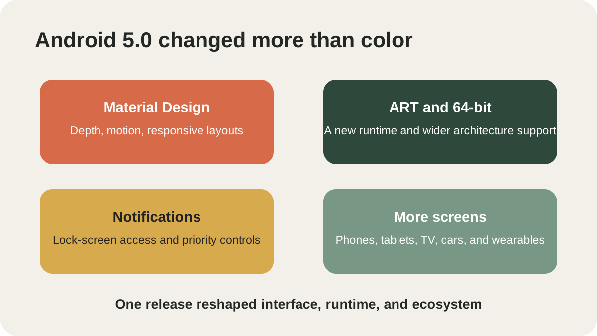
Google announced Android 5.0 Lollipop on October 15, 2014. The release gave Android a new visual language called Material Design, but it was much more than a coat of paint. Lollipop also replaced the old Dalvik runtime with ART, introduced 64-bit platform support, reworked notifications and extended a more coherent Android experience across phones, tablets, televisions, cars and wearables.
The result was one of Android’s clearest dividing lines. Earlier releases had steadily refined the platform; Lollipop tried to make its parts feel like one designed system. Google framed that diversity with the phrase “Be together. Not the same.”, acknowledging that common rules and varied hardware had to coexist.
What did Material Design change on the screen?
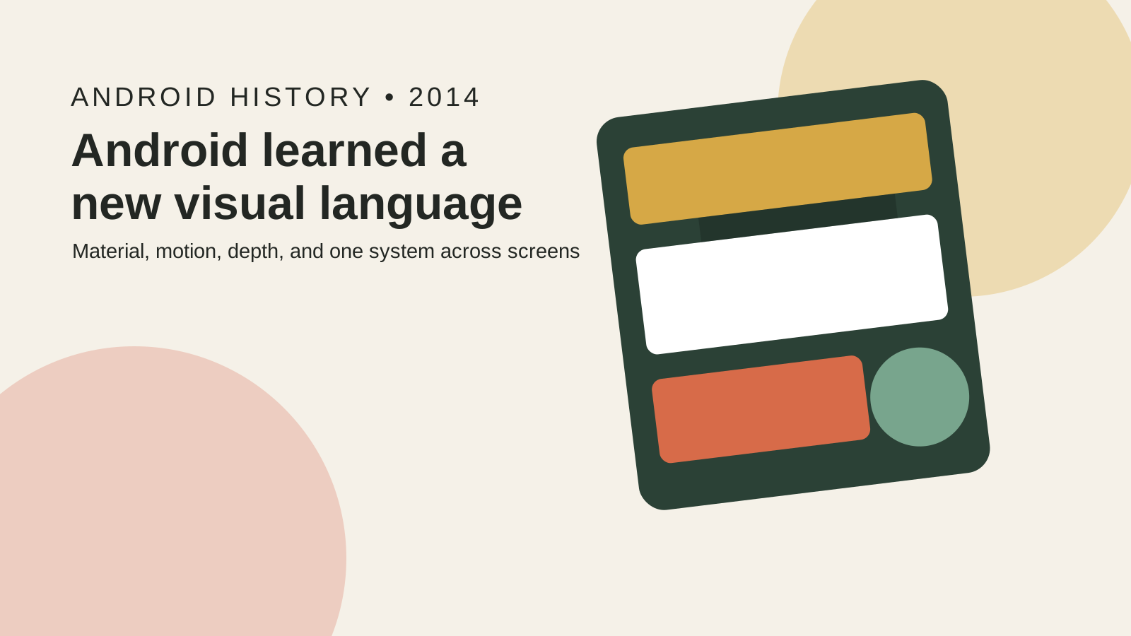
Material Design treated interface elements as layered surfaces with consistent relationships, shadows and motion. Cards could appear to rise above a background, buttons responded with ripple animations, and transitions showed where an object came from or went. Bright color and generous typography made the system visually distinct from the darker Holo interface used in preceding Android versions.
This was not meant to simulate paper literally. The “material” was a design metaphor: surfaces had understandable depth, while animation communicated cause and continuity. A button press should produce visible feedback; a shared image could move between screens instead of disappearing and reappearing without context.
Google provided themes, elevation, vector drawables, activity transitions and other tools so app developers could use the same concepts. The official Lollipop overview described Material Design as both a platform appearance and an expanded UI toolkit. Adoption still took time because developers had to update their apps and support older Android versions.
Why was a shared design language important for Android?
By 2014, Android ran on products from many manufacturers, each with its own interface choices. Variety was a strength, but it could also make apps and system screens feel unrelated. Material Design gave Google apps, third-party software and multiple device types a common grammar without requiring every phone to look identical.
Consistency helps ordinary users predict behavior. A floating action button, layered card or transition can indicate what is interactive and what changed. For developers, reusable patterns reduce the need to invent every screen from scratch. For manufacturers, the system remained customizable through color, type, icons and added features.
That balance was aspirational. Some apps retained older designs, and vendor interfaces applied Material principles selectively. “One language” therefore describes Google’s direction, not a claim that every Lollipop phone became visually uniform on launch day.
| Lollipop layer | Major change | Lasting significance |
|---|---|---|
| Interface | Material Design surfaces, motion and responsive layouts | A common visual vocabulary for Android and Google products |
| Runtime | ART replaced Dalvik as the standard runtime | A new foundation for app execution and memory management |
| Hardware support | 64-bit ABIs joined 32-bit support | Prepared Android for newer processors and larger address spaces |
| Daily use | Lock-screen notifications, priority controls and redesigned recents | Information and tasks became easier to reach |
| Ecosystem | Phone, tablet, TV, car and wearable experiences | Android was presented as a family of screens |
What changed beneath the new interface?
Lollipop ran exclusively on ART, Android Runtime. ART used ahead-of-time compilation and included changes to garbage collection, debugging and performance behavior. A user did not press an “ART” button, but the runtime affected how applications were installed and executed. Outcomes varied by app and device, so it would be inaccurate to promise a universal speed increase.
The release also supported 64-bit application binary interfaces. Java-language apps could benefit without source changes in many cases, while apps using native code needed suitable 64-bit libraries. Android kept 32-bit compatibility; the transition was a platform expansion, not an overnight removal of older software.
Project Volta added tools and APIs aimed at battery-efficient software, including Battery Historian for examining power events. The Android team called Lollipop its biggest update to date in the official developer summary, a defensible description given the simultaneous design, runtime and architecture changes.
How did Lollipop change notifications and multitasking?
Notifications moved onto the lock screen, where users could see and act on important information without navigating through the phone. Priority controls helped decide which interruptions could get through, while heads-up notifications presented urgent events over the current task. These choices made notifications more useful but also raised privacy questions when a phone was lying in view, so visibility controls mattered.
The Overview screen displayed recent tasks as a stack of cards. Applications could expose more than one document or activity in that list, making recents closer to a task manager than a simple list of app icons. Lollipop also expanded multiple-user ideas, including guest access on phones, though availability and vendor implementations varied.
These features show how Material Design and system behavior reinforced each other. Cards and motion were not merely decoration; they provided a visual model for notifications and tasks.
Did every Android phone receive the same Lollipop experience?
No. Google released the platform and updated Nexus devices, while other manufacturers adapted Lollipop to their hardware and interfaces on their own schedules. Chipset support, drivers, testing, carrier approval and product priorities all affected whether and when an existing phone was upgraded.
Even devices on the same Android version could use different launchers, settings layouts, camera apps and multitasking features. Google services were another layer, updated separately in many cases. Android 5.0 therefore defined APIs and baseline behavior, not one immutable consumer interface.
This was the same ecosystem tension that Android 4.4 had approached from the resource side. KitKat tried to make current Android practical on low-memory hardware; our guide to Android One’s 2014 launch shows Google also experimenting with reference designs and direct updates for affordable phones.
Why does Lollipop still matter today?
Material Design continued to evolve, and today’s Android no longer looks exactly like Android 5.0. Yet the idea that motion, shape, color and depth should form a documented cross-product system survived. Later versions changed the visual vocabulary, most notably with Material You, while building on the expectation of a coherent design framework.
The less visible foundations also endured. ART became Android’s continuing runtime, 64-bit support grew from an option into a central platform requirement, and battery analysis became increasingly systematic. Lollipop is therefore a useful lesson in reading major OS updates: the interface attracts attention, but runtime and architecture choices often last longer.
Android 5.0 itself is obsolete and should not be used as a secure daily platform. Its place in the Android history timeline is the moment Android tried to look, move and operate like one family across an expanding range of devices—and changed expectations for every release that followed.