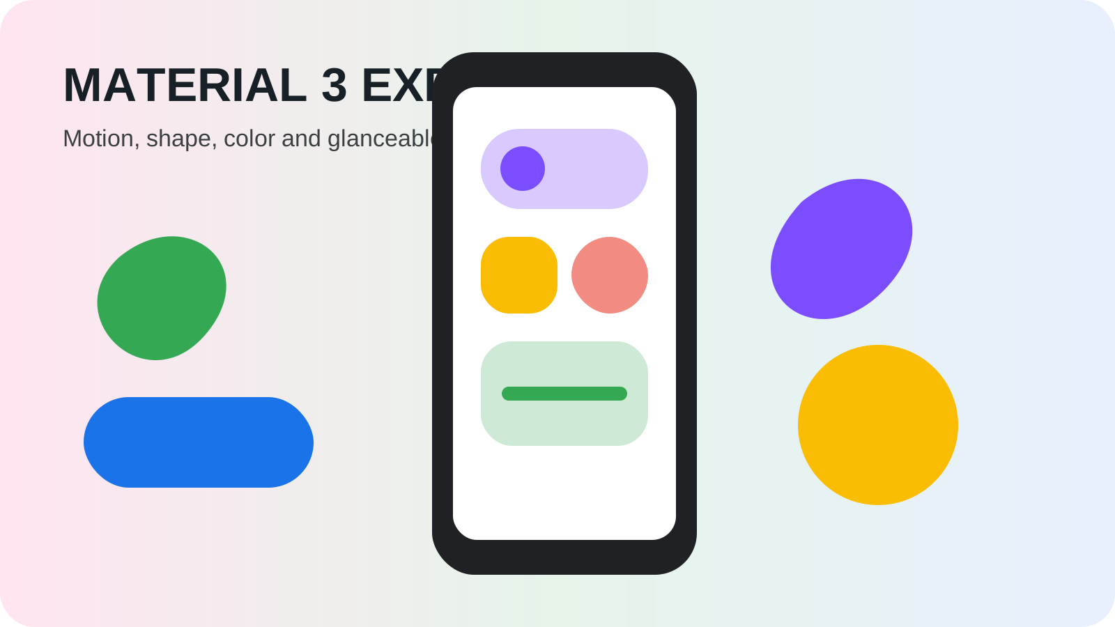
On May 13, 2025, Google introduced Material 3 Expressive for Android and Wear OS. It was presented as one of the company’s largest design updates in years, building on Material You with more varied shapes, stronger typography, dynamic color and spring-like motion. Pixel devices were scheduled to receive the new look later in the year rather than on the announcement day.
That timing is the first important lesson. Material 3 Expressive was a design system announcement, not a new Android version that instantly repainted every phone. Android 16 provided platform foundations, Google apps adopted components on their own schedules, and other manufacturers remained free to use their own visual languages.
What is a Material design system?
A design system is a shared set of principles, components, styles and behaviors for building interfaces. It defines familiar pieces such as buttons, toolbars, type scales, color roles and motion. Developers can adopt those pieces so apps feel coherent without drawing every control from scratch.
Material Design began long before 2025. Material You, introduced with Android 12, made personalization and wallpaper-derived dynamic color central to the system. Material 3 Expressive extended that foundation. Google’s launch overview emphasized personality, fluid interaction and information that could be understood at a glance.
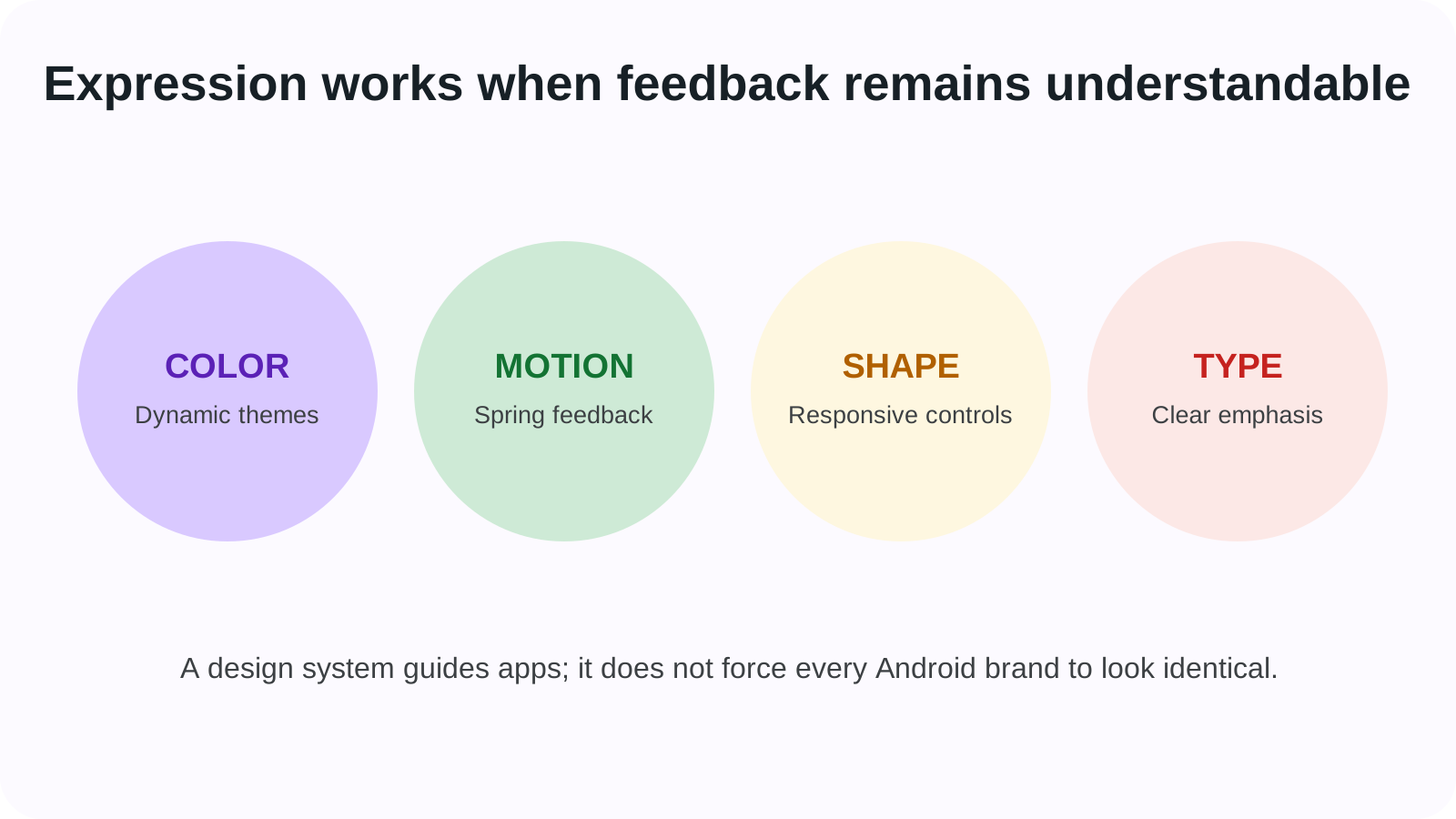
Using a design system does not make all apps identical. Components can follow a brand theme and developers decide which patterns fit a task. The system provides guardrails and tested behavior; good product design still requires hierarchy, clear writing and restraint.
What changed visually from Material You?
Dynamic color remained, but palettes and component options became richer. Typography gained greater emphasis so important actions and information could stand out. Quick Settings tiles could use multiple sizes, allowing a person to fit more compact controls or emphasize frequently used ones.
Shapes became more varied and responsive. Buttons could expand, compress or morph as state changed. Background blur in the notification shade created depth while retaining some awareness of the app underneath. These choices made the interface more animated and distinctive than a simple theme refresh.
| Design ingredient | Material 3 Expressive direction | Useful purpose |
|---|---|---|
| Color | Expanded dynamic themes across system and apps | Personalization and visual grouping |
| Typography | Stronger scale and emphasis | Faster recognition of important information |
| Shape | More varied, responsive components | Differentiate actions and states |
| Motion | Spring physics and shape morphing | Show cause, response and continuity |
| Haptics | Tactile feedback paired with movement | Confirm selected physical-feeling actions |
| Layout | Resizable Quick Settings and glanceable surfaces | Let users prioritize information |
The design was expressive by intent, but expression was not supposed to obscure function. A dramatic animation that hides state or delays an action would work against the system’s purpose.
Why did Google put so much emphasis on motion?
Motion can explain a relationship that a static screen leaves ambiguous. When a notification is dismissed and nearby cards respond, the movement confirms what the gesture affected. When a button changes shape after a press, the interface acknowledges the action and exposes its new state.
Material 3 Expressive introduced a motion-physics system with spring behavior. Google’s Androidify implementation article showed developers how expressive motion schemes and morphable shapes could be used in Jetpack Compose. This made the design more than a collection of marketing images; components and libraries were becoming available to app makers.
More motion is not automatically more usable. People sensitive to animation may use reduced-motion settings, and low-powered devices must maintain responsiveness. Developers need to treat motion as feedback rather than decoration that blocks input. Consistency also matters: if every element bounces with equal intensity, nothing communicates priority.
How did Live Updates fit the new design?
Live Updates, introduced at the platform level with Android 16, provide progress for ongoing activities such as rides, deliveries and navigation. Material 3 Expressive gave those notifications prominent, glanceable surfaces so a person could check progress without opening the app.
This is an example of platform function and visual system meeting. Android 16 defines the notification capability and app behavior; the expressive interface decides how that information is arranged, animated and prioritized on a supported device. A manufacturer can implement the platform function through a different-looking surface.
The same distinction applies to Quick Settings. Android supplies system controls, while Material components determine their shape, size and feedback in Google’s interface. Confusing the layers leads to the false expectation that every Android 16 phone should look like a Pixel.
What changed on Wear OS?
Wear OS 6 adapted the design to a round display. Lists and scrolling motion followed the circular edge, buttons could hug the bottom curve and dynamic color from the watch face could extend through system surfaces and tiles. Google said platform optimizations could provide up to 10 percent better battery life on watches updating from Wear OS 5 under its test conditions.
Round-screen design illustrates why responsive components matter. A rectangular phone button placed unchanged on a watch wastes the curved edges and may create small touch targets. Wear-specific components could expand near the center and contract near the top and bottom, preserving glanceability.
Material 3 Expressive was therefore one system with form-factor adaptations, not a command to make phones and watches identical. Cars, tablets and other surfaces also needed layouts suited to viewing distance, input and context.
Did every Android app need to adopt the new look?
No. Material libraries were available to developers, and Google’s Android Show developer summary described early components and tools. App teams could migrate gradually, retain brand colors and decide whether expressive pieces fit their interface.
Applications built with older Material versions did not stop working. Nor did Android require games, media experiences or heavily branded products to replace all custom controls. Platform compatibility and visual adoption are different questions.
Manufacturer skins also continued. Samsung One UI, Xiaomi HyperOS and other interfaces could implement Android 16 without using Google’s Pixel presentation. Material 3 Expressive most directly described Google’s design language and the tools offered to Android developers.
What were the rollout limits in May 2025?
May 13 was an unveiling. Google said Pixel devices would receive the Android and Wear OS refresh later in the year. Individual Google apps could update before or after the system, and third-party apps depended on developer work. Screenshots from the announcement should not be treated as the appearance of every phone on that date.
Some effects also depended on hardware. Haptic quality varies, high-refresh displays render motion differently and watches have tighter power limits. Accessibility settings and user preferences could change animation or color.
The best historical description is therefore “introduced in May and rolled out in stages,” not “Android changed overnight.” This pattern is common in modern mobile software, where design systems, apps and operating systems have separate release channels.
Why does Material 3 Expressive still matter today?
Material 3 Expressive marked a change in Android’s visual confidence. Material You had made color personal; Expressive added stronger motion, shape and typographic hierarchy. The system argued that useful software could feel lively without abandoning consistency.
It also exposed an important distinction for anyone studying Android: the platform, the Pixel interface and the app design system overlap but are not the same thing. Understanding those layers explains why two phones can share an Android version and still look and feel different.
In the Android history timeline, the May 2025 announcement precedes Android 16’s June release and Pixel 10’s August hardware. Its influence appeared across those later products, making it a design milestone whose rollout was gradual but whose vocabulary—dynamic, responsive and glanceable—continued well beyond one launch event.