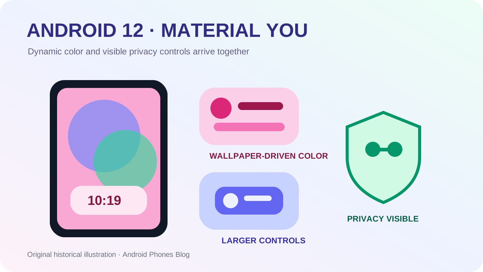
On October 19, 2021, Android 12 began rolling out to supported Pixel phones with a redesigned interface called Material You. Wallpaper colors could shape parts of the system palette, widgets were rebuilt around the new visual language, and the lock screen, notifications and settings used larger, more expressive forms. Google’s official consumer overview paired that visual change with a Privacy Dashboard, camera and microphone indicators, approximate location and quick switches for disabling those sensors.
Android 12 source had been released to AOSP on October 4. The October 19 date marks the first Pixel consumer rollout and Google’s complete user-facing presentation, not the simultaneous arrival of identical styling on every Android brand.
What made Material You different from a normal redesign?
Most interface redesigns apply one palette chosen by the product team. Material You made selected color relationships responsive to the user’s wallpaper. On Pixel, Android could extract colors, construct a coordinated palette and apply it to surfaces such as Quick Settings, the lock screen, controls and compatible widgets.
The system also changed scale and shape. Quick Settings used larger tiles, notifications had more rounded grouping, and the lock screen could give the clock much more space when no alerts were present. Motion linked transitions so that screens felt connected rather than replaced abruptly.
The “You” did not mean every pixel was freely designed by the owner. Android still generated combinations within rules intended to preserve contrast and coherence. Personal input selected a starting point; the design system decided how to turn that input into usable interface roles.
How did dynamic color work as a system rather than a filter?
A simple filter would tint every element alike and could make text unreadable. Dynamic color instead generated related tones for different jobs: prominent accents, containers, backgrounds and text. Light and dark themes needed their own values, and contrast had to remain sufficient across states.
| Material You layer | Input or rule | Visible result |
|---|---|---|
| Wallpaper analysis | Colors in the selected image | Candidate source colors |
| Palette generation | Tonal and contrast relationships | Coordinated light and dark values |
| System application | Defined interface roles | Themed settings, controls and lock screen |
| App participation | Widget and Material support | A more consistent experience beyond system UI |
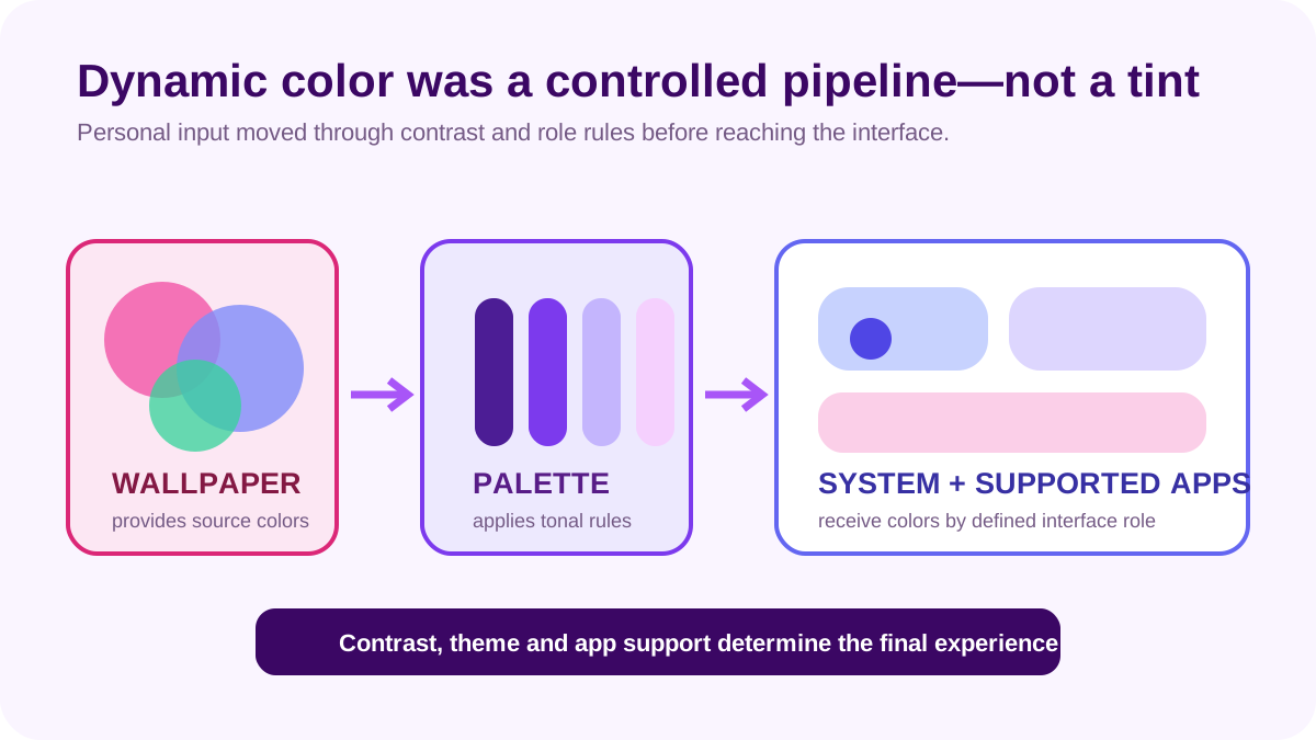
This distinction explains why app support mattered. A widget designed with fixed colors could clash with the system even when Android itself looked coherent. Android 12 expanded widget APIs and design guidance so developers could make shapes, spacing and colors respond more naturally.
Did every Android 12 phone receive the same Material You look?
No. Android is a platform used through manufacturer interfaces such as Samsung One UI, and vendors retain visual identities. Google’s October article said the dynamic color experience was available on Pixel first and would reach more manufacturers and phones. The AOSP release provided the platform base, but a consumer device still needed vendor integration and an update.
Even on one phone, third-party apps did not all adopt Material You at once. System UI, Google apps and independent applications followed different release schedules. A screenshot of a fully coordinated Pixel represented the intended experience, not proof that the entire Android app catalog changed on October 19.
The official AOSP release announcement named Samsung, OnePlus, Oppo, Realme, Tecno, Vivo and Xiaomi among partners expected to bring Android 12 to devices later. That phrasing is useful historical evidence of a staged ecosystem rollout.
How did the Privacy Dashboard make invisible access visible?
Android permissions determine whether an app may use sensitive capabilities, but a user may forget when access occurred. The Privacy Dashboard presented a timeline showing recent use of location, camera and microphone and provided a route to the responsible app and its settings.
Android 12 also added a status-bar indicator when the camera or microphone was active. Quick Settings switches could disable camera or microphone access at a system level. Together, these controls addressed three moments: noticing access now, reviewing access later and stopping a sensor broadly when desired.
The dashboard did not explain whether every access was justified. A maps app may need location, while an unrelated tool may not. Context remained a human decision. Android improved the evidence and the path to act on it.
This built on Android 11’s one-time permissions and auto-reset, continuing a move from one setup decision toward permission management across the life of an app.
What did approximate location change?
Android 12 let a user give an app an approximate location instead of precise coordinates. A weather app may need the general area, while turn-by-turn navigation needs finer detail. The control made that difference expressible at the operating-system level.
This was not anonymity. Approximate location still conveys meaningful geographic information, and an app can combine data from other permitted sources. It was a data-minimization option: provide enough location for a task without automatically disclosing the most precise value available.
Android 12 also introduced separate Bluetooth permissions so companion apps could discover and connect to nearby devices without using location permission as the indirect route required by earlier platform behavior. The official developer feature guide documents the new scan, advertise and connect permissions.
What other changes sat behind the new colors?
Android 12 added a standard splash-screen experience, scrolling screenshots, improved picture-in-picture behavior, AVIF image support and APIs for richer haptics and graphics. App hibernation extended the unused-app idea by resetting permissions and clearing temporary resources. Performance Class gave apps a standard way to identify a defined group of capable hardware features.
Some changes also required developer migration. Apps targeting Android 12 had new restrictions on starting foreground services from the background, exact alarms and exported components. The release could therefore look like a visual update to a user while demanding substantial compatibility work from an app team.
That dual character is common in Android history. Interface design attracts attention because it is visible, but security, media, performance and component rules determine how software behaves after the screenshot is taken.
Pixel 6 and Pixel 6 Pro launched with Android 12 on the same date as the Pixel rollout announcement. Their bold camera bar and new Google Tensor chip gave the redesigned system new reference hardware. Material You demonstrated Google’s software identity while Tensor emphasized a closer relationship among mobile hardware, machine learning and Google services.
The two stories should not be collapsed. Dynamic color was an Android design system and did not require Tensor to calculate a basic palette. Tensor enabled other Pixel-specific camera, speech and security capabilities. Read our Pixel 6 and Google Tensor history for that separate hardware shift.
Together, the releases showed how Google used Pixel as an early presentation of Android while the broader platform remained available to many manufacturers.
Why does Android 12 still matter today?
Android 12 made personalization structural rather than decorative. A user’s choice could flow through a controlled palette, widgets and system surfaces, while privacy information became a visible part of the interface. Later Android versions extended both dynamic theming and permission controls, but the 2021 release established the recognizable foundation.
For present-day users, its lesson is to look beyond a theme’s appearance. Check whether contrast remains clear, whether third-party widgets participate and whether privacy indicators lead to understandable controls. The Android history collection follows how those expectations developed. Android 12 matters because it made a phone feel personally coherent while making some of its most sensitive behavior easier to see.