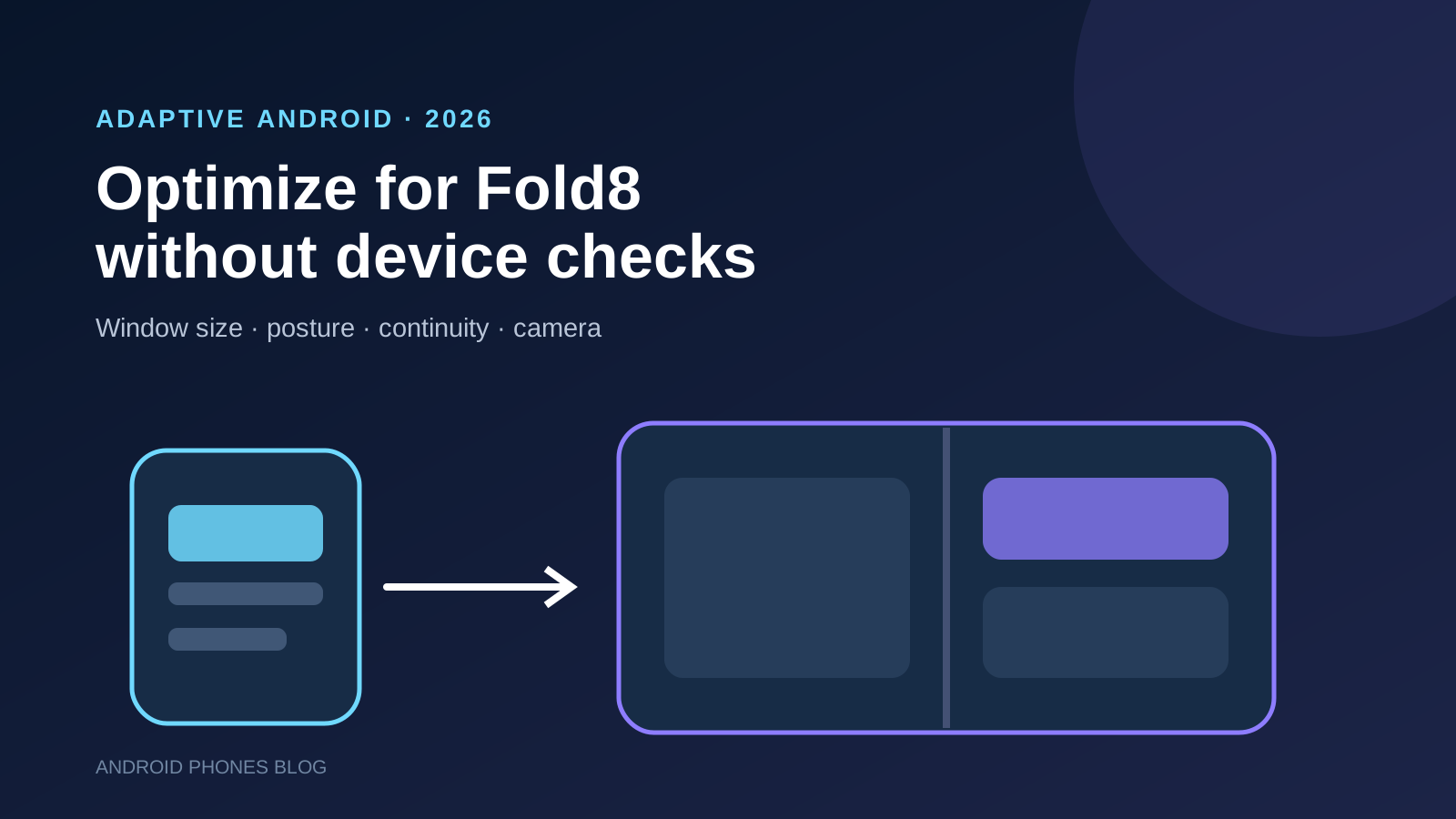
To optimize an Android app for Galaxy Z Fold8, stop treating orientation or physical screen size as the layout API. Make the activity resizable, calculate the current app window’s size class, adopt a one-, two- or three-pane canonical layout, account for a separating fold, preserve state through configuration changes and test camera transforms across every window transition.
Key takeaways
- Build for the current app window, not the words “phone,” “tablet” or “Fold8.” The same device can expose compact, medium and expanded widths.
- Use width-first Window Size Classes and centralize layout decisions instead of scattering device and orientation checks through the app.
- Let content reflow. A stretched phone column is technically compatible but wastes Fold8’s landscape-first inner display.
- Treat fold/unfold, rotation, split screen and freeform resizing as continuity events: selection, scroll position and in-progress input should survive.
- Camera previews need dedicated testing. Prefer CameraX
PreviewView; Camera2 apps should useCameraViewfinderand update transforms as the window changes.
Why does Galaxy Z Fold8 change the optimization target?
Samsung’s 2026 Fold8 uses a shorter, wider shape than a conventional phone and emphasizes landscape use on its inner display. Google’s launch guidance describes it as landscape-first and tells developers to avoid hardcoded orientation and size assumptions.
The important change is not one set of pixel dimensions. A Fold8 app can run on the cover display, fill the inner display, share that display in multi-window mode or occupy a resizable desktop-style window. The allocated app area can change while the activity remains part of the same user task.
That makes a device-specific if (model == Fold8) branch the wrong foundation. Query the space Android gives the app and render the appropriate structure. This also improves tablets, other foldables, ChromeOS and desktop windowing.
For the hardware differences between Samsung’s three 2026 foldables, see our Galaxy Z Fold8 Ultra vs Fold8 vs Flip8 buyer guide. The development guidance here applies most directly to Fold8’s new geometry but should remain device-agnostic in code.
What should replace orientation and device checks?
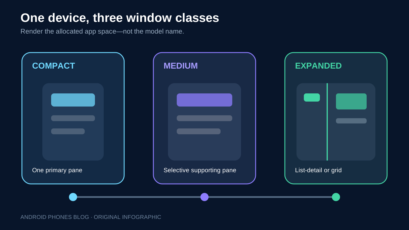
Use the current app window as the source of truth. Android’s adaptive-app guidance recommends current window metrics and Window Size Classes because physical display size and rotation do not reveal how much space the app actually owns.
Width classes provide a manageable first layer:
| Available width | Typical structure | Common Fold8 situation |
|---|---|---|
| Compact | One primary pane, bottom navigation | Cover display or narrow split screen |
| Medium | One pane with more room, or selective supporting pane | Resized or divided inner window |
| Expanded | List-detail, supporting pane or feed grid | Full inner display |
These are viewport decisions, not device labels. The Fold8 can move between them. Most apps can use width as the main breakpoint because vertical content scrolls naturally; add height and posture only where they change the interaction.
With Compose, obtain adaptive window information from the Material 3 Adaptive APIs and pass a small layout state down the hierarchy. With Views, calculate window metrics and inflate or configure the appropriate layout. Keep the decision near the root so individual components do not invent conflicting breakpoints.
Official runnable starting point: JetNews in Google’s Compose samples demonstrates an adaptive news layout and state handling. Use the linked October 8 checkout (5a390e4a9d3c) and run its JetNews module with that revision’s Gradle instructions and version catalog. It is a Compose sample, not a Views implementation or a Fold8 certification test. Pair it with the Compose state-saving examples.
Version scope, reviewed October 8, 2026: the Material 3 Adaptive release page lists stable 1.3.0; the WindowManager release page lists stable 1.5.1. These references describe the libraries used for Compose adaptive layouts and Views window/posture queries respectively; they do not assert that JetNews uses both versions. Resolve the sample’s own dependencies rather than copying APIs between versions.
How should the layout use Fold8’s wider inner display?
Start from a canonical layout that matches the information relationship.
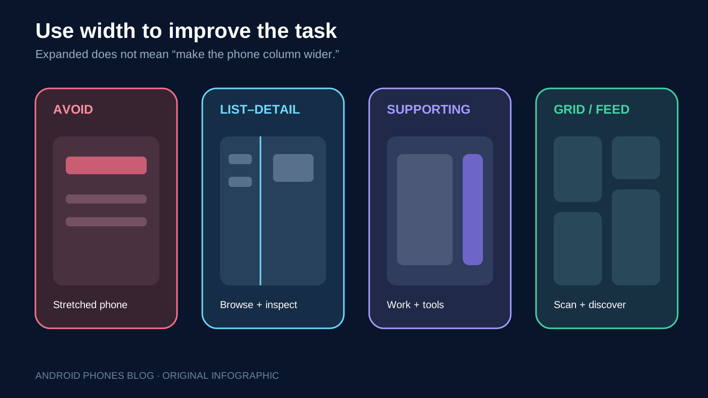
- List-detail keeps a collection beside the selected item. It suits messages, products, settings, documents and inventory.
- Supporting pane keeps tools, context, participants or controls beside the primary work area.
- Feed uses a responsive grid and varied content emphasis for media, discovery or dashboards.
Compose Material 3 Adaptive supplies scaffolds such as ListDetailPaneScaffold and SupportingPaneScaffold. They can show panes together when space is expanded and navigate between them when width becomes compact. Navigation can similarly shift from a bottom bar to a rail.
Do not simply increase the maximum width of a phone column until lines become hard to read. Set sensible content widths, increase the number of columns or reveal related context. The goal is better task throughput, not merely fewer empty pixels.
Google’s July post also points to stable Compose Grid, Flexbox and MediaQuery APIs in the April 2026 BOM (2026.04.01). Use those primitives where they reduce custom breakpoint math, but keep the layout behavior testable and understandable.
How should the app handle the fold and hinge?
Not every fold has the same impact. A fold may be flat and non-separating, or it may divide the window into logical regions in book or tabletop posture. Use Jetpack WindowManager or the Compose adaptive posture data to detect a FoldingFeature, its state, orientation and whether it separates the content area.
When the feature separates the window:
- Avoid placing a tap target, dialog action or critical text directly over it.
- Keep a continuous photo, map or video from losing important content beneath an occluded area.
- Align two-pane content with the physical regions when that helps the task.
- Keep touch targets reachable in tabletop posture.
- Recalculate after every window-layout update rather than caching the original geometry.
Do not split every interface just because a fold is present. A flat, non-occluding Fold8 may be best treated as one expanded canvas. Posture is an additional signal, not a replacement for width.
The older Android 12L large-screen and foldable guide explains the platform shift that made adaptive layouts a core Android requirement. Fold8 turns that general requirement into a concrete release priority.
How can the app preserve continuity during fold and resize?
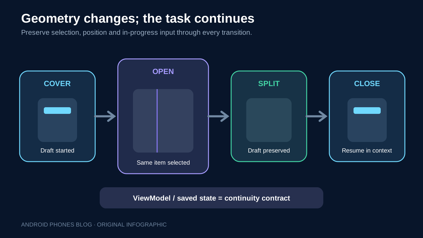
Opening the device, changing posture, rotating it or resizing the app can trigger configuration changes and recreation. A user should not lose a half-written message, selected record, playback position, cart or filter because the window became wider.
Hoist business and screen state out of fragile view instances. Use a ViewModel for state that must survive configuration change, and save the minimum restorable state needed if the process is later reclaimed. Compose components can use saveable state for appropriate UI values; View-based screens need equivalent explicit restoration.
Copy this continuity record and enter your build, device, selected item and draft text before each run:
| Action | Expected result | Pass/fail and evidence |
|---|---|---|
| Start on cover; open inner display | Same selected record and unfinished input | Not run — record build and screenshot |
| Enter split screen; drag across width classes; restore full screen | Panes reflow; selection and scroll remain | Not run — record sizes and screenshot |
| Close and resume on cover | Continue the same task | Not run — record settings and result |
| Recreate activity, then restore after process loss | Restore saved minimum state; ViewModel alone does not survive process death | Not run — record reproduction steps |
Selection is particularly important in list-detail layouts. When an expanded two-pane window narrows, keep the detail visible if the user was working there. When it expands again, restore the list beside the same selected item.
What camera problems appear on a foldable?
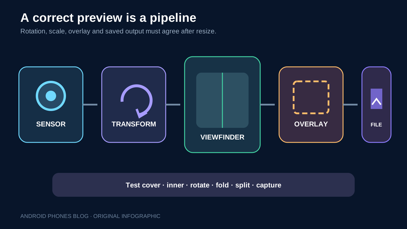
Camera apps combine sensor orientation, display rotation, preview aspect ratio, window dimensions and user posture. A preview can be sideways, stretched or cropped incorrectly if code assumes a fixed portrait display.
Google recommends CameraX PreviewView for most apps because it handles rotation, scaling and transforms. Apps that need Camera2 should use the backward-compatible CameraViewfinder library and update the preview as layout and display conditions change.
Copy this camera record; use the same scene and overlay across transitions:
| Test step | Expected result | Pass/fail and evidence |
|---|---|---|
| Preview on cover/inner; resize through widths | Upright image with intended fit/crop | Not run — screenshot and window size |
| Rotate, fold/unfold and switch front/rear | Preview and controls adapt without stretching | Not run — device/build and recording |
| Capture a document or barcode after resize | Overlay matches capture; saved output orientation is correct | Not run — retain input and output |
A correctly rotated preview can still be functionally broken if a scanning guide no longer matches the captured region. Test the overlay, capture and output together.
What input and accessibility checks matter on Fold8?
Expanded displays attract keyboard, mouse, trackpad and stylus use even when the phone is usually touch-first. Verify tab order, focus visibility, hover states, keyboard shortcuts where appropriate, right-click behavior and text selection.
Larger windows also expose accessibility problems that a compact layout hides. Test increased font size without clipping, reflow at high display scaling, logical reading order across panes and adequate touch targets near edges and the hinge. Do not encode meaning only by which side of the fold contains an element.
Material 3 components help establish adaptive navigation and input behavior, but they do not replace app-specific review. Our Material 3 Expressive Android design guide provides broader design context; Fold8 optimization still begins with structure and continuity rather than decoration.
What Fold8 test matrix should a release include?
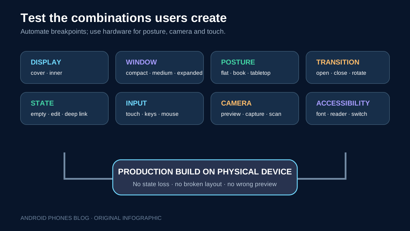
Use emulators for fast breakpoint coverage and at least one physical Fold8-class device for hinge, camera, thermal and touch behavior. Test the production build, not only a debug configuration.
Copy the matrix into the release ticket. Record the device, OS, library versions and production build; all rows below are unexecuted checks, not our test results.
| Test step | Expected result | Pass/fail and record |
|---|---|---|
| Cover → inner; external display if supported | Layout uses current app window | Not run — device/build |
| Resize compact → medium → expanded and back | Navigation/panes change without clipped content | Not run — width and screenshot |
| Try flat, book and tabletop postures where supported | Important controls avoid a separating fold | Not run — posture |
| Drag split-screen divider; resize desktop window | Content reflows continuously | Not run — window sizes |
| Rotate; background/return; fold/unfold | Current task remains usable | Not run — reproduction steps |
| Open deep link; edit draft; play media; restore state | Selection, saved input and playback context retained as designed | Not run — state before/after |
| Use touch, keyboard, mouse and supported stylus | Focus and actions remain reachable | Not run — input type |
| Preview/capture/video; resize scanner overlay | Upright preview and correct output framing | Not run — camera/output |
| Increase font/scaling; use screen reader/switch access | No clipping; logical reading and focus order | Not run — settings |
Add screenshot or golden tests for representative size classes, UI tests for state restoration and automated resize tests where your toolchain supports them. Manual exploratory testing remains necessary for continuous divider dragging, posture and camera experience.
A practical optimization sequence
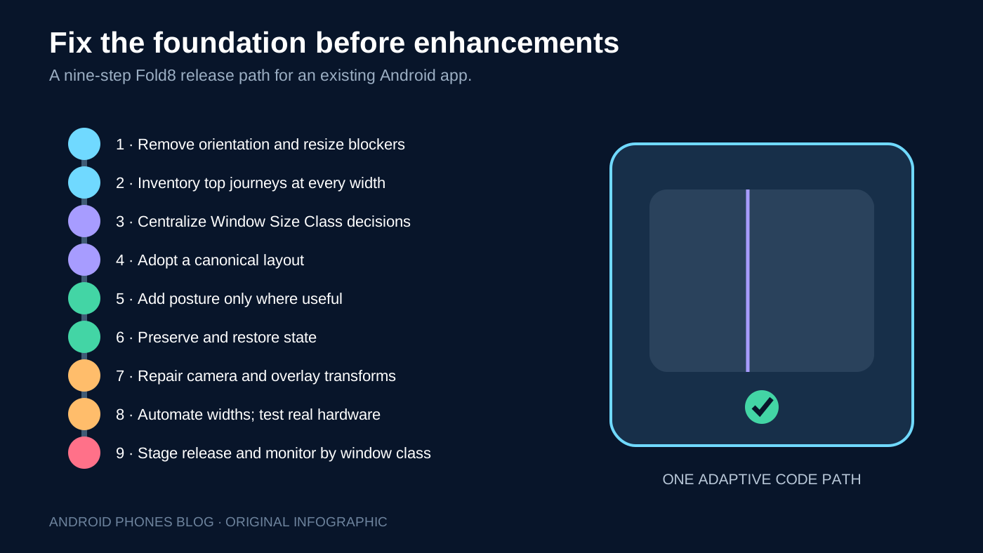
Teams do not need to rewrite the entire app before improving Fold8 behavior. Prioritize by user value and failure severity.
Copy this nine-step release checklist into the same ticket:
| Step | Deliverable | Owner / result |
|---|---|---|
| 1. Remove resize/orientation assumptions | Resizable activity | Unassigned / not run |
| 2. Inventory top journeys | Baseline at each width | Unassigned / not run |
| 3. Centralize window calculation/navigation | Shared layout decision | Unassigned / not run |
| 4. Convert highest-value layout | List-detail, workspace or feed | Unassigned / not run |
| 5. Add useful posture behavior | Controls avoid fold where needed | Unassigned / not run |
| 6. Hoist and restore state | Continuity record above | Unassigned / not run |
| 7. Repair camera transforms | Camera record above | Unassigned / not run |
| 8. Complete automated and physical tests | QA evidence above | Unassigned / not run |
| 9. Stage release and monitor | Crashes, jank and task-completion record | Unassigned / not run |
Avoid a Fold8-only fork that will age separately from the main app. A single adaptive code path is easier to test and will support the next foldable shape with less emergency work.
Final recommendation
Treat Galaxy Z Fold8 as a demanding test of a modern Android app, not as a special device that deserves a parallel layout tree. Base structure on the current app window, use canonical layouts at meaningful breakpoints, add posture only when the fold changes the task and preserve state through every transition.
Use the copyable continuity, camera and nine-step tables above as your release record. The release is ready when a user can begin on the cover screen, open to a productive inner layout, resize the app, use the camera and close the device without losing context or encountering a broken preview. That standard benefits the entire large-screen Android ecosystem, including the broader Pixel Fold and large-screen app experience.
Review record — October 8, 2026: Added official sample and version scope plus unexecuted QA records; removed the 2013–2025 history banner. Guide context: July 22, 2026 launch; this is implementation guidance, not a hardware review.