Archive update: TED launched its official Android app on March 15, 2012, giving Android phone and tablet users access to more than 1,100 TED Talks. The important feature was not simply mobile playback: the app supported downloads, offline search and audio-only listening at a time when reliable mobile data was far less common than it is today.
What did the TED Android app offer?
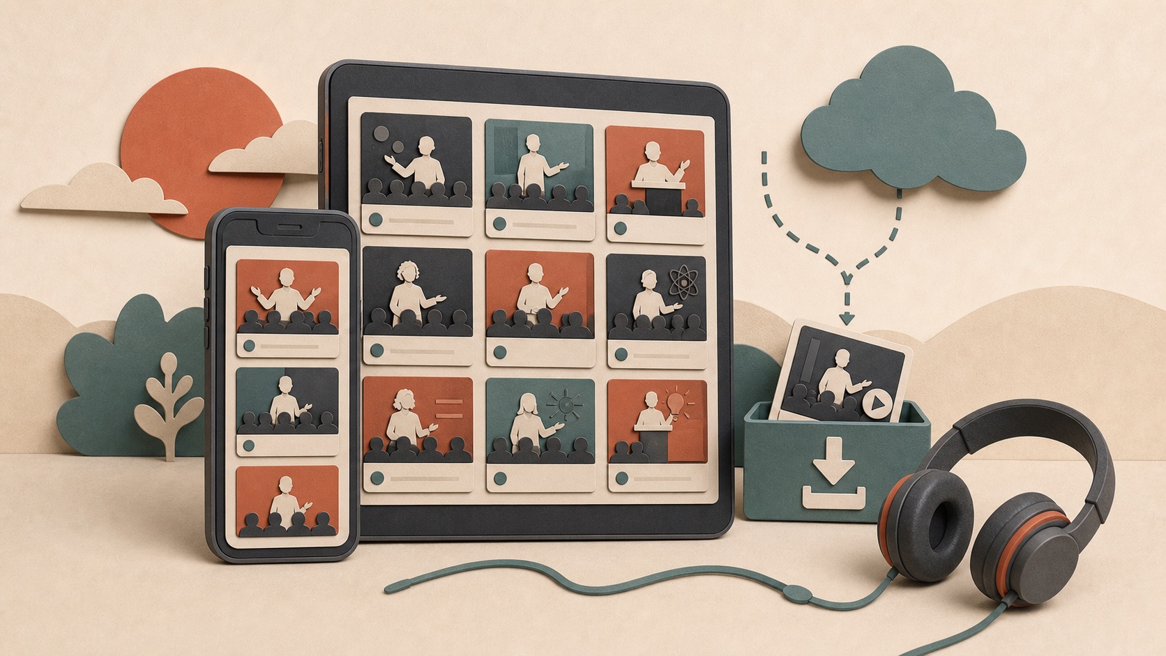
The first official release combined TED’s complete talk library with features designed around mobile use. Users could browse by theme, tag, rating or popularity, search by speaker or subject, bookmark talks and share discoveries through social networks or email.
The app’s most practical functions were offline video and audio downloads. Someone could save a talk before a flight or commute, then play it without an internet connection. TED also included a curated audio stream for people who wanted to listen while exercising, driving or working.
Why did offline access matter so much in 2012?
Mobile video depended on conditions that varied widely. Coverage could disappear on a train or inside a building, data plans often made long streams expensive, and public Wi-Fi was not a reliable assumption. A lecture that played smoothly at home could pause repeatedly during a commute. Downloading before leaving moved that uncertainty to a time and network chosen by the user.
Offline audio offered another form of efficiency. A talk whose value came mainly from speech did not always need a video stream. An audio file used less storage and bandwidth and allowed listening when watching a screen was inconvenient. TED was therefore adapting not only to network limits but also to different attention contexts.
Offline search completed the workflow. Saving many talks would be less useful if a disconnected user could not find them. By keeping searchable information available locally, the application treated offline mode as a planned product state rather than an error page. That is the deeper design lesson: reliable mobile software anticipates disconnection before the connection disappears.
| Feature in 2012 | Why it mattered |
|---|---|
| Offline video and audio | Reduced dependence on slow or expensive mobile data |
| Offline library search | Made saved content easier to find while disconnected |
| Audio-only playback | Turned visual talks into a podcast-like experience |
| Phone and tablet layouts | Supported a fragmented Android hardware market |
| Daily talk updates | Kept the app connected to TED’s growing catalog |
How did discovery work inside a library of 1,100 talks?
A large catalog creates a choice problem. Visitors may know a speaker’s name, have only a subject in mind or simply want a highly rated talk. Browsing by theme, tag, rating and popularity gave each of those users a starting point. Search handled direct intent, while curated and popularity-based views could surface something unfamiliar.
Bookmarks added a second step between discovery and consumption. A user could notice an interesting talk during a short break, save it and return when there was time to watch. Sharing extended discovery beyond the application because a recommendation could travel through email or a social network with the context of a trusted person.
Daily updates were important for a different reason: they made the app a live catalog rather than a static collection released once. New talks created a reason to return, but they also increased the importance of filters, search and saved items. As the library grew, navigation quality became part of the content product itself.
Why was device support noteworthy?
Android hardware was already diverse in 2012. TED said the app was designed to adapt to ordinary smartphones, tablets, the Kindle Fire and even the dual-screen Sony Tablet P. That responsive approach anticipated a problem Android developers still face: one content experience must work across many screen sizes and form factors.
What did “supporting phones and tablets” require?
Android applications could not assume one resolution, aspect ratio or physical size. A phone held vertically needed compact navigation and readable text, whereas a tablet could show more information beside a video. The dual-screen Sony Tablet P introduced an additional interruption through the middle of the available display. The Kindle Fire brought another device and distribution context.
Responsive support meant deciding which parts of the experience should scale, reflow or move. Video needed to preserve its aspect ratio. Lists needed touch targets large enough to use without wasting tablet space. Downloads and saved items had to remain understandable on every layout. Performance also mattered: an interface that fit the screen could still fail if thumbnails or playback overwhelmed the hardware.
TED’s announcement is useful because it framed device variety as a normal design condition. The goal was not to make the same screenshot appear everywhere. It was to preserve the same tasks—discover, save, download and play—while arranging them for the screen in front of the user.
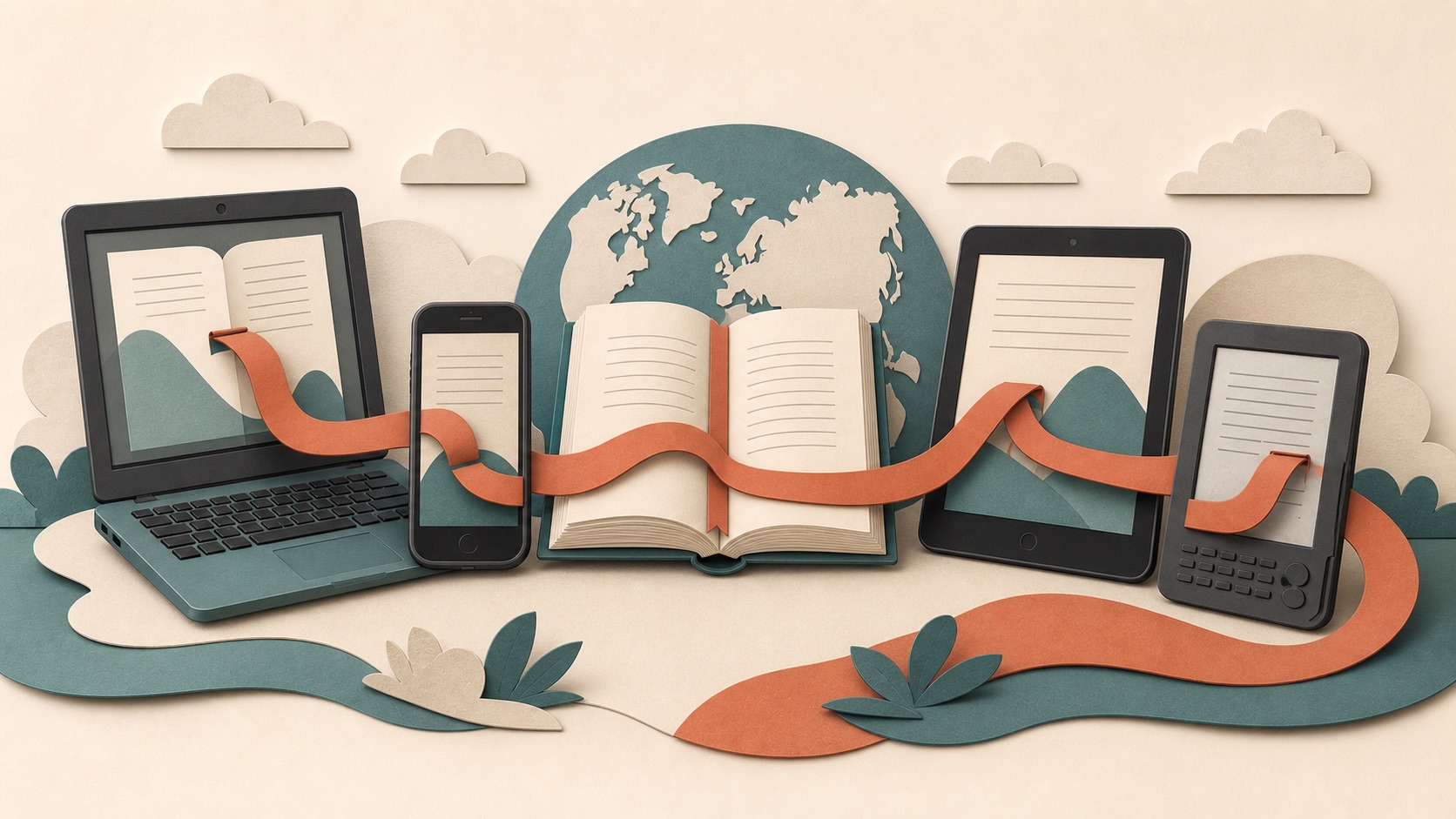
The catalog strategy resembled Amazon’s cross-platform Kindle apps in one important respect: the service followed the user instead of remaining tied to a single device. Kindle emphasized synchronized reading position across multiple operating systems; TED emphasized adaptable layouts and downloads for intermittent connectivity. Both treated the content library as the durable product and each screen as an access point.
Why was this more than a smaller version of TED’s website?
A mobile application could use operating-system features and local storage to support a workflow built around movement. Downloads, bookmarks and audio listening belonged close to the device’s media controls and available storage. The app could remember a personal queue and open directly into a touch-friendly catalog instead of asking a browser page to imitate a desktop experience.
The strongest features addressed constraints unique to the mobile moment. A commuter needed continuity without a signal. A listener needed audio without keeping a screen active. A tablet user expected a layout that took advantage of more space. Those needs explain why the launch mattered even though TED videos were already available on the web.
Is this information still current?
This page preserves the launch record rather than describing the current TED app feature set. App-store availability, account requirements and supported devices can change. Anyone installing TED today should use the current Google Play listing and TED’s support information as the source of truth.
The launch also reflects how far Android had moved since the Nexus One and Android 2.1 period. By 2012, a major media publisher had to plan for phones, tablets, the Kindle Fire and unusual devices such as the Sony Tablet P—not just one reference handset.
How should readers use this restored article today?
Use it to understand the 2012 product decisions, not to predict the current TED application. The number of talks, download behavior, account features and device support can all change. Current installation and privacy decisions should be based on TED’s present listing and documentation.
The historical value lies in the design priorities: catalog discovery, planned offline use, audio as an alternative format and layouts that adapt across Android hardware. Those priorities remain useful when evaluating any modern education or media app, even when the networks and devices are much faster.
The larger lesson remains relevant: useful mobile content products account for intermittent connectivity, different devices and moments when audio works better than video. For more historical Android coverage and current buying advice, visit the cross-device content collection or our Android phone guides.